This post was most recently updated on July 27th, 2022.
4 min read.This ages-old trick deserves to be published – since it makes it easy to quickly show info from pretty much any other page on pretty much any Classic SharePoint page (in a SharePoint-compatible pop-up). So, here goes:
Using SharePoint’s JavaScript library to open an arbitrary pop-up
Yes – SharePoint contains all the functionality out-of-the-box, and you almost don’t have to do anything yourself! Let’s see how this works.
Okay – long story short. On all Classic SharePoint pages, you can call this function: SP.UI.ModalDialog.ShowPopupDialog(). Like it says, it quite simply just opens a pop-up dialog, showing the page that it finds from the URL.
See below for a simple example:
<!-- Opens a pop-up -->
<a onclick="javascript:SP.UI.ModalDialog.ShowPopupDialog('https://yourtenant.sharepoint.com/sites/intranet/Pages/default.aspx')">Show more!</a>
What’s cool about this, is that you can show pretty much any page (that allows it) in this pop-up! For an example, see below.
This works in SharePoint Online, SharePoint 2010, SharePoint 2013, SharePoint 2016, and even SharePoint 2019… As long as you’re using Classic SharePoint, you should be good! The best part is that it’s ridiculously easy.
How to show SharePoint pages in pop-ups?
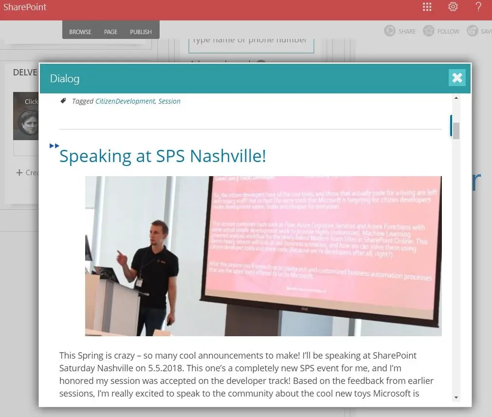
But let’s imagine a different use case – showing another SharePoint page in a pop-up. You can use the same function for that!
This is very useful for showing other SharePoint pages in the context of whatever page the user is currently browsing. For example, this could look something like this:
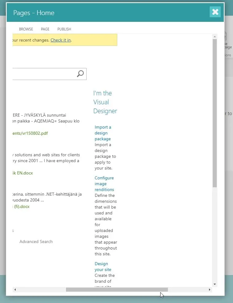
As you can probably imagine, showing just “any” page in SharePoint in a pop-up might also cause weird layout issues. This is especially true with out-of-the-box SharePoint sites, that is not responsive – they won’t always play nice in a pop-up! Luckily, the code for showing that pop-up appends the ?IsDlg=1 to the URL of the page, to hide the chrome of the page. That makes the page act a lot nicer.
If this doesn’t work for whatever reasons, you should modify the URL you’re passing to the method to include “IsDlg=1” as a parameter. See this post for more details:
The following script example shows how to use this:
<!-- Opens a pop-->
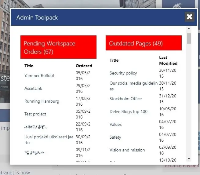
<a onclick="javascript:SP.UI.ModalDialog.ShowPopupDialog('https://yourtenant.sharepoint.com/sites/intranet/Pages/default.aspx?IsDlg=1')">Show more!</a>Showing responsive SharePoint pages in pop-ups
However, if you’re using responsive styles in your SharePoint site, it might work reasonably well (even though the pop-up is going to be pretty
One thing to note, however, is that you customize the size of the pop-up to offer more space for the contents. To achieve this, you’ll have to change the method call you’re using, though!
Next, let’s take a look into how to do that…
How to customize the pop-up in SharePoint?
You can actually tweak how the pop-up works in quite a few different ways. If you call .showModalDialog() instead of .ShowPopupDialog() (it’s interesting that Microsoft decided to deviate from camelCase there!), you can replace the “
Below, I’ve gathered the different configuration values you can pass on to the function. You’ll need to add them as additional properties for the “options” object – let’s see how that works!
Documentation of .showModalDialog()’s options:
| “options” object’s properties | Description |
|---|---|
| title | A string that contains the title of the dialog. |
| URL | A string that contains the URL of the page that appears in the dialog. If both URL and HTML are specified, the URL takes precedence. Either URL or HTML must be specified. |
| HTML | A string that contains the HTML of the page that appears in the dialog. If both HTML and URL are specified, the URL takes precedence. Either URL or HTML must be specified. |
| x | An integer value that specifies the x-offset of the dialog. This value works like the CSS left value. |
| y | An integer value that specifies the y-offset of the dialog. This value works like the CSS top value. |
| width | An integer value that specifies the width of the dialog. If width is not specified, the width of the dialog is autosized by default. If the autosize is false, the width of the dialog is set to 768 pixels. |
| height | An integer value that specifies the height of the dialog. If the height is not specified, the height of the dialog is autosized by default. If the autosize is false, the dialog height is set to 576 pixels. |
| allowMaximize | A Boolean value that specifies whether the dialog can be maximized. True if the Maximize button is shown; otherwise, false. |
| showMaximized | A Boolean value that specifies whether the dialog opens in a maximized state.
|
| showClose | A Boolean value that specifies whether the Close button appears on the dialog. |
| autoSize | A Boolean value that specifies whether the dialog platform handles dialog sizing. |
| dialogReturnValueCallback | A function pointer that specifies the return callback function. The function takes two parameters, a dialogResult of type SP.UI.DialogResult Enumeration and a returnValue of type object that contains any data returned by the dialog. |
| args | An object that contains data that are passed to the dialog. |
Okay – how to use this new knowledge in practice? See below for an example!
Example of a SharePoint pop-up with custom options
If you decide to open the pop-up with options, your code might look something like this:
var options = SP.UI.$create_DialogOptions();

options.title = "A standard SharePoint Publishing site in a dialog will look funky.";
options.width = 400;
options.height = 600;
options.url = "https://yourtenant.sharepoint.com/sites/publishing";

// Note the different casing here:
SP.UI.ModalDialog.showModalDialog(options);
Simple and straightforward!
Links and References
See these 2 MSDN articles for more info:
He's been a developer from 2004 (starting with PHP and Java), and he's been working on .NET projects, Azure, Office 365, SharePoint and a lot of other stuff. He's also Microsoft MVP for Azure.
This is his personal professional (e.g. professional, but definitely personal) blog.
- CSOM suddenly throwing exceptions when trying to access list contents in SharePoint? A weird fix. - April 2, 2024
- “Predefined type ‘System.Object’ is not defined or imported” and other System namespace stuff missing in your solution? - March 26, 2024
- How to import GraphQL schema to Postman in Windows? - March 19, 2024


